top of page
.jpeg)
Starbucks
2026 | Packaging
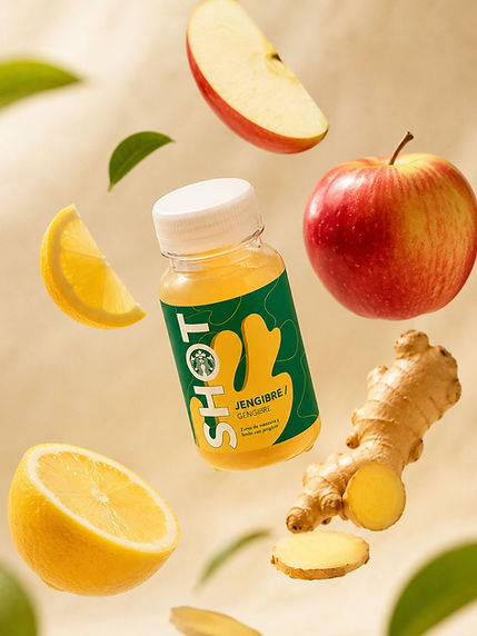
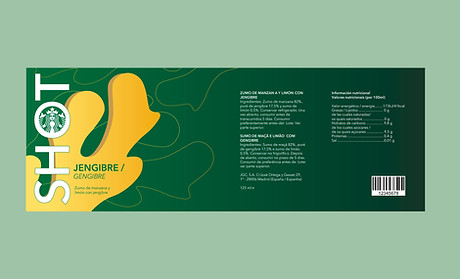
The starting point was a real product from Starbuck: a ginger, apple and lemon shot whose original packaging lacked a distinct visual identity. The goal of this redesign was to elevate the product's shelf presence, maintain coherence with the brand's visual ecosystem, and reflect the essence of the key ingredient through graphic language.
The final palette pairs Starbucks' corporate green with an ochre yellow that directly references the natural color of ginger and the drink itself. The root-shaped graphic silhouette works simultaneously as an illustrative element and a typographic container, unifying form and message into a cohesive piece.
.jpeg)

bottom of page